The brief
The brief was to conceptualise and generate a name and logo design that would instantly convey that, as a contemporary empathetic brand, this brand wishes to support a variety of globally significant environmental causes. In this spirit, a brave new brand, Rootpax, was born.
The solution
The word ‘root’ is associated with stability, strength and growth, suggesting a rooted and well-grounded brand. A root symbolises the very foundation from which things grow and thrive. There can be no growth without a healthy root.
Interestingly, the word root has become synonymous with cause – as in root cause. A root cause is the core issue which needs to be identified in order to solve a problem. By identifying a cause, people can set in motion the cause-and-effect problem solving thinking required by all forms of human endeavour. In this case, Rootpax seeks to bring a sense of urgency and responsibility to the root causes of environmental problems. An understanding of the root cause of a problem can lead to eliminating the source, as opposed to trying to fix the resulting ill effects.
Pax means peace in Latin, relating directly to the mission of the business: to try to bring a little more peace and joy into the world through acts of kindness and collaboration. Pax also means person or persons, which points to the need for humans to be part of the solution.
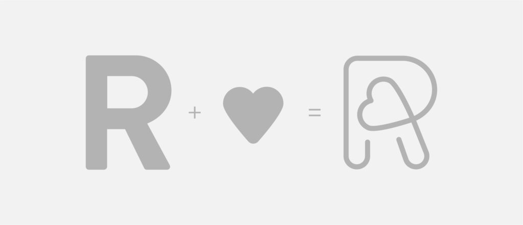
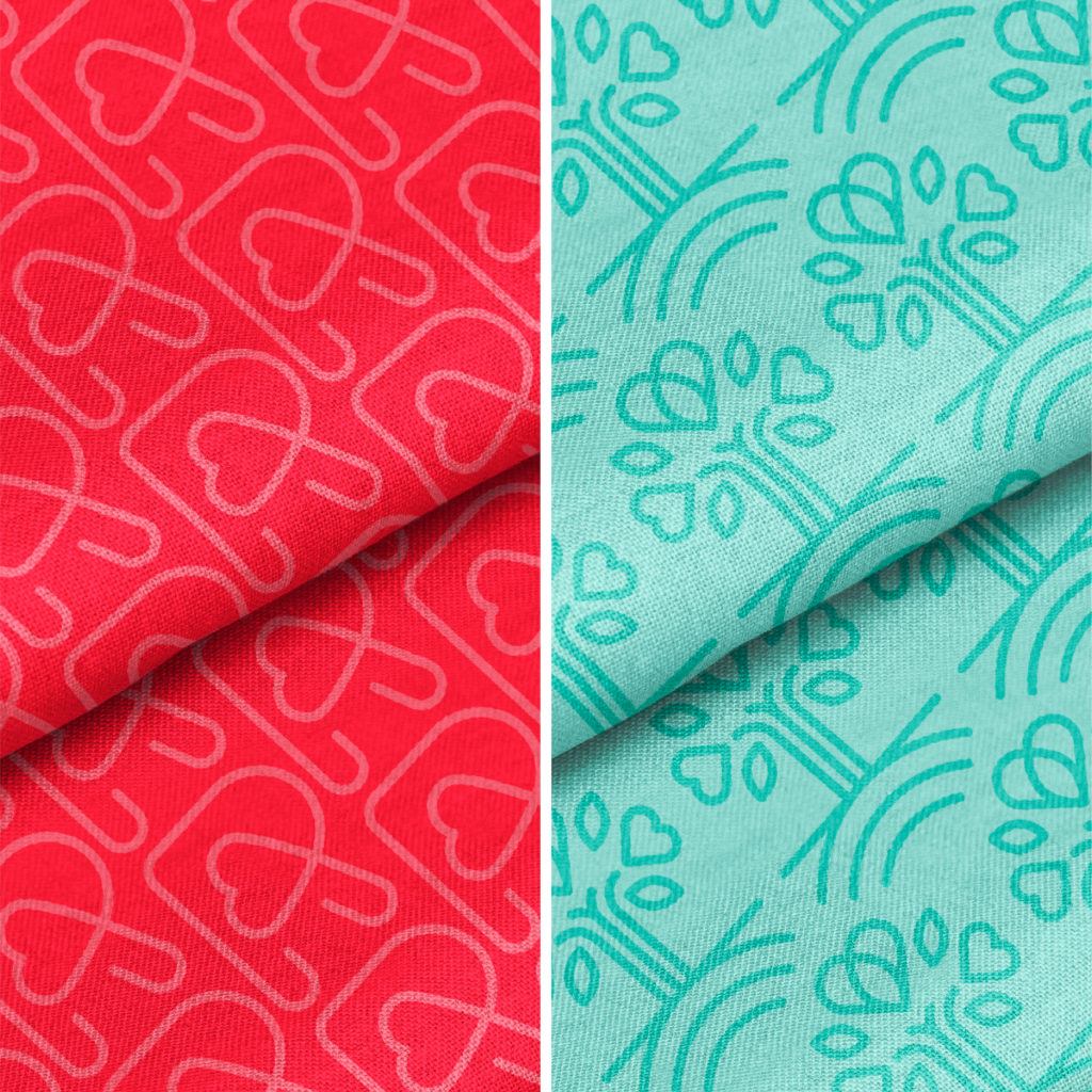
A heart shape has consciously been incorporated into the design of the logo and all collateral elements, expressing the brand’s humanitarian roots, signalling the love and generosity upon which the business is built. It is, at its core, all about spreading happiness, togetherness and hope.
Visit Rootpax at www.rootpax.com
